-
News & Trends -
Sales -
Marketing Related Topics -
B2B Software Guides Related Topics -
Free Tools & Resources -
- About Us About Us

Landing pages are stand-alone web pages used to get the visitor to take a specific action, such as signing up for an e-letter or subscription, or to make an outright purchase. Landing pages can be automatic pop-ups, but most are triggered by the visitor clicking a prompt, ad, or website tab. Marketing and sales teams typically strategize the use of multiple landing page styles across one website. This way, some pages act as a lead generation tool and others track visitor engagement.
The top 10 most common landing page styles include:
We’ve gathered examples of each landing page style from real companies and explained why they work as a lead generation tool, as well as split test ideas for each. Businesses utilize split tests on marketing or web campaigns to test components of the ad to obtain the most engagement from their site visitors.
Lead capture landing pages are pop-up or click-triggered pages that act as a gatekeeper of some intellectual property or even discounts that the visitor is after. They tempt the visitor to give up information like their email, name, job title, or phone number in exchange for a downloadable whitepaper, template, or discount code. This style of landing page is popular and used often because of its success rate. It works because there’s an even exchange happening.
Here’s an example of a lead capture landing page from HubSpot:
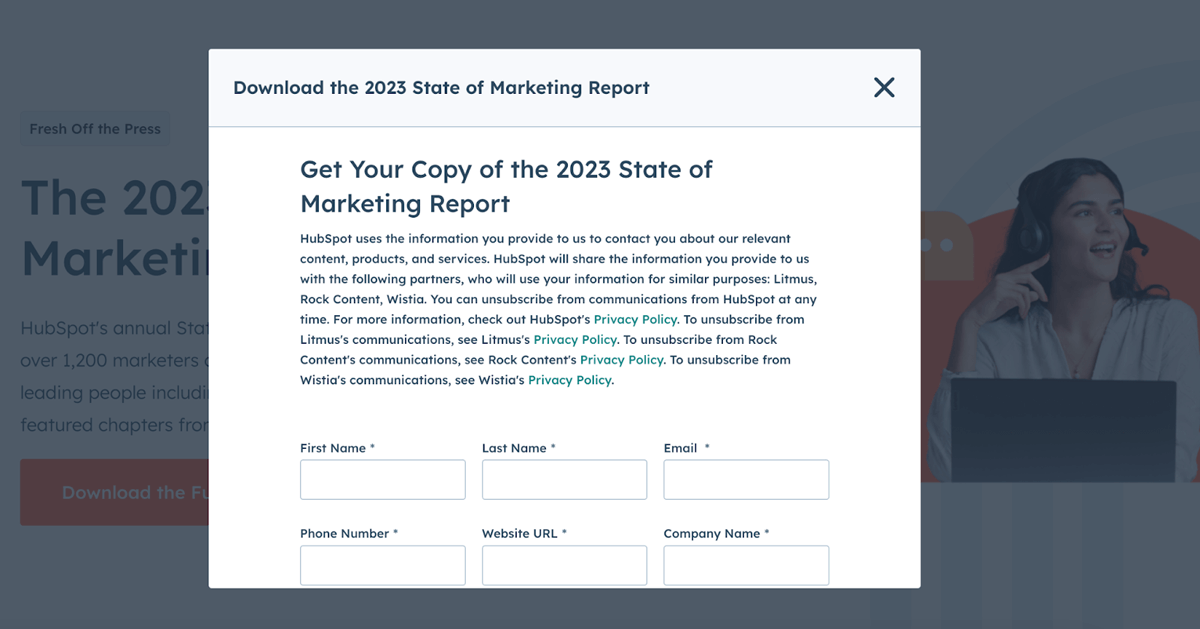
HubSpot’s lead capture form exchanges their newest report for detailed information from their visitors. It does a great job of explaining to the visitor that to get this new report, you have to fill out the below form while also telling them what they plan on doing with your information, such as subscribing you to a mailing list with similar content to the report you’re currently after. They also ask for a range of valuable information, such as name, company info, and contact info.
An opportunity for a split test with lead capture pages is to have a version that asks for surface-level information like email address and phone number, and another that asks for zip code, job title, or the industry they’re in. This can help your sales and data teams see if your visitors prefer and engage more with lead captures that ask for basic information or if they don’t mind filling out more forms.
Long form sales pages are unique landing pages that work to give the visitor as much information on the front end as possible. This is usually in the form of a high-quality and well-produced video or other content element. At the end of the video, it prompts the visitor to a call-to-action (CTA). Another form might pop-up that gives the visitor the opportunity to fill in contact information or click to sign up.
Trello’s long form sales page looks like this:
Trello’s long form sales landing page is a short video showcasing the top core features of the site. This works well because it answers every question a potential customer might have about their product. Regular landing pages are more minimal in both content and direct information they give about the solution, whereas long form sales pages like Trello’s are meant to act as a quick elevator pitch of your solution.
The trouble with long form sales landing pages is they risk losing the attention of your visitor, especially if they’re on your website with specific intentions. They may not want to wait around to watch a video, even if it's only 45 seconds. A split testing opportunity is to have videos with different productions, such as music and live actors versus animation, to see if one prompts more engagement than the other.
Squeeze landing pages are similar to lead capture pages because they’re directly targeting some information from the visitor, specifically their email address. Squeeze pages target your email address to add you to their email marketing list and are usually in the form of pop-ups. They can be gatekeepers to discount codes or exclusive access to deals.
Below is an example of Talentless’ squeeze page:
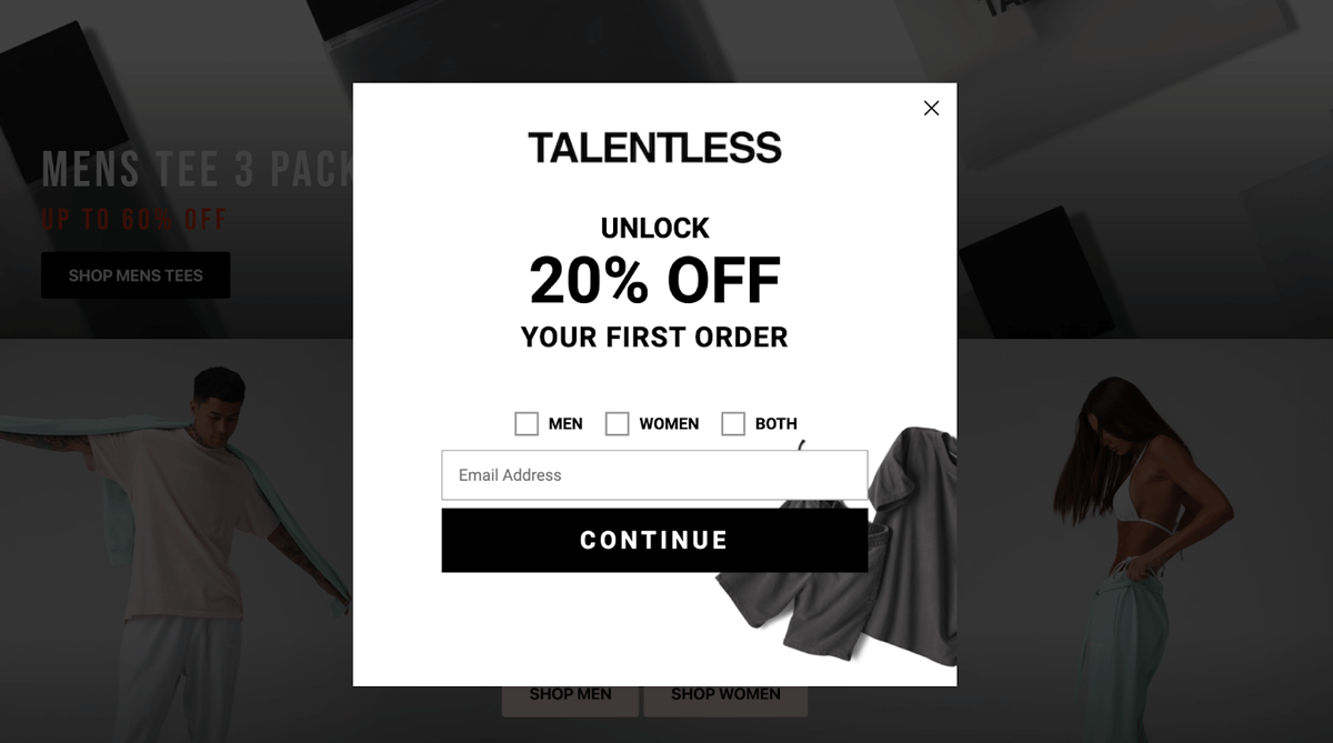
Talentless’ page is minimal and brand cohesive and presents the discount offer as enticing. Squeeze landing pages like this are good alternatives to full lead capture pages because they ask for less information and usually lead to quicker exchanges. The visitor can quickly plug in their email address and immediately be granted access to the discount. Talentless also collects information like what kind of category of clothes the visitor is interested in.
To get the most out of a squeeze page, your business can use a minimalist and clean-cut design like this example and another version with more visual landscape. This will help test if your audience prefers clarity and simplicity when giving out information or if they enjoy the design aspects. You could also add another element box asking for more information, like their customer’s zip code to start tracking site visitors’ geographical data.
Splash pages are short-form landing pages that don’t necessarily have to have an obvious CTA for the visitor. They’re meant to be intermediate pages, usually as a stop between an ad the visitor clicked to get them to the main site. A splash page can include an introduction to the site or options for the visitor to configure site settings, like picking country and language preferences.
Here is an example of a splash page from Zara:

Zara’s splash pages can offer valuable metrics for the marketing and sales teams to track. This landing page will show how many visitors the site receives from which social media platform plus what country and language the visitor selects. This insight can help shape future campaigns directed towards their major target markets.
A way to level up a splash page is to make sure your brand name is easy to see to increase UX/UI and overall site accessibility. Since these landing pages are meant to be introductory and welcoming visitors to your site, using images that clearly show your merchandise or service can help keep those visitors engaged.
Click-through landing pages are similar to splash pages because they both act as half-way or checkpoints for the visitor to bypass the entire site. Click-through pages do often have a very clear CTA for the reader, like directly signing up for a free trial. Their goal is to get the visitor to the transaction page as quickly as possible.
An example click-through landing page from Progressive looks like:
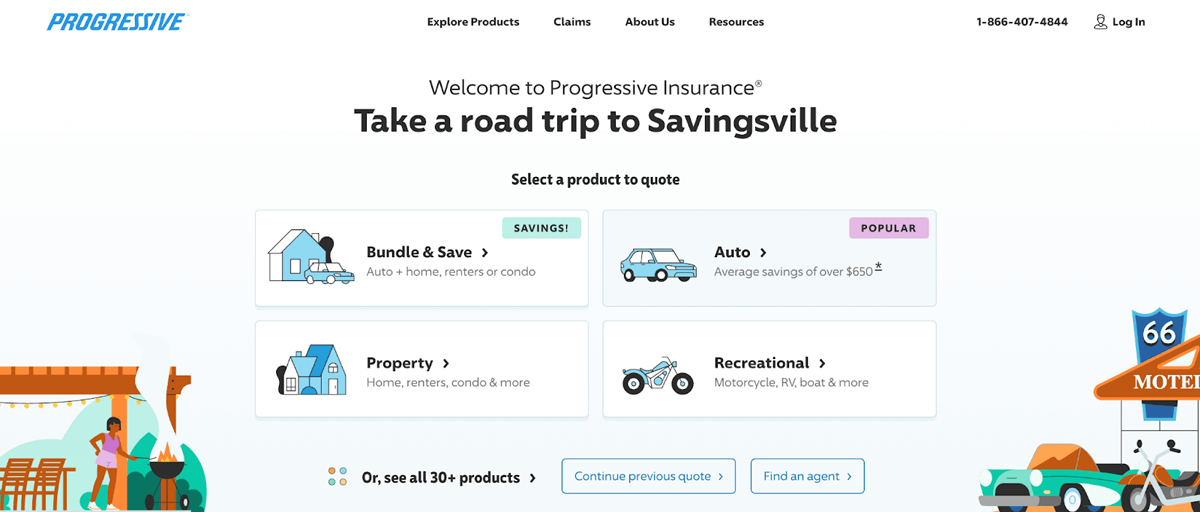
Progressive uses a click-through feature on their homepage by offering to provide personalized insurance quotes for the top assets they cover. This is to get visitors to the quote as quickly as possible and then to purchase their service with the quote. This makes tracking Progressive’s conversion much easier because it directs their visitors immediately to a purchase.
A split test opportunity for click-through landing pages is to use different styles of buttons and CTAs. If you’re offering a quote like Progressive in your click-through, consider putting some eye-catching words in the trigger button, so one version says “Click for an INSTANT free quote” and another reads “Click for a free quote” to see which pulls the most clicks from visitors.
Unsubscribe landing pages are a last effort to keep subscribers before they leave. This page is either from them clicking the unsubscribe button directly from their email or from the visitor updating their communication preferences in the account settings of your site. This page will ask if the subscriber is sure they want to unsubscribe, and they might even be given options to clean up what newsletters or notifications they receive without unsubscribing completely.
Intuit’s unsubscribe page looks like this:
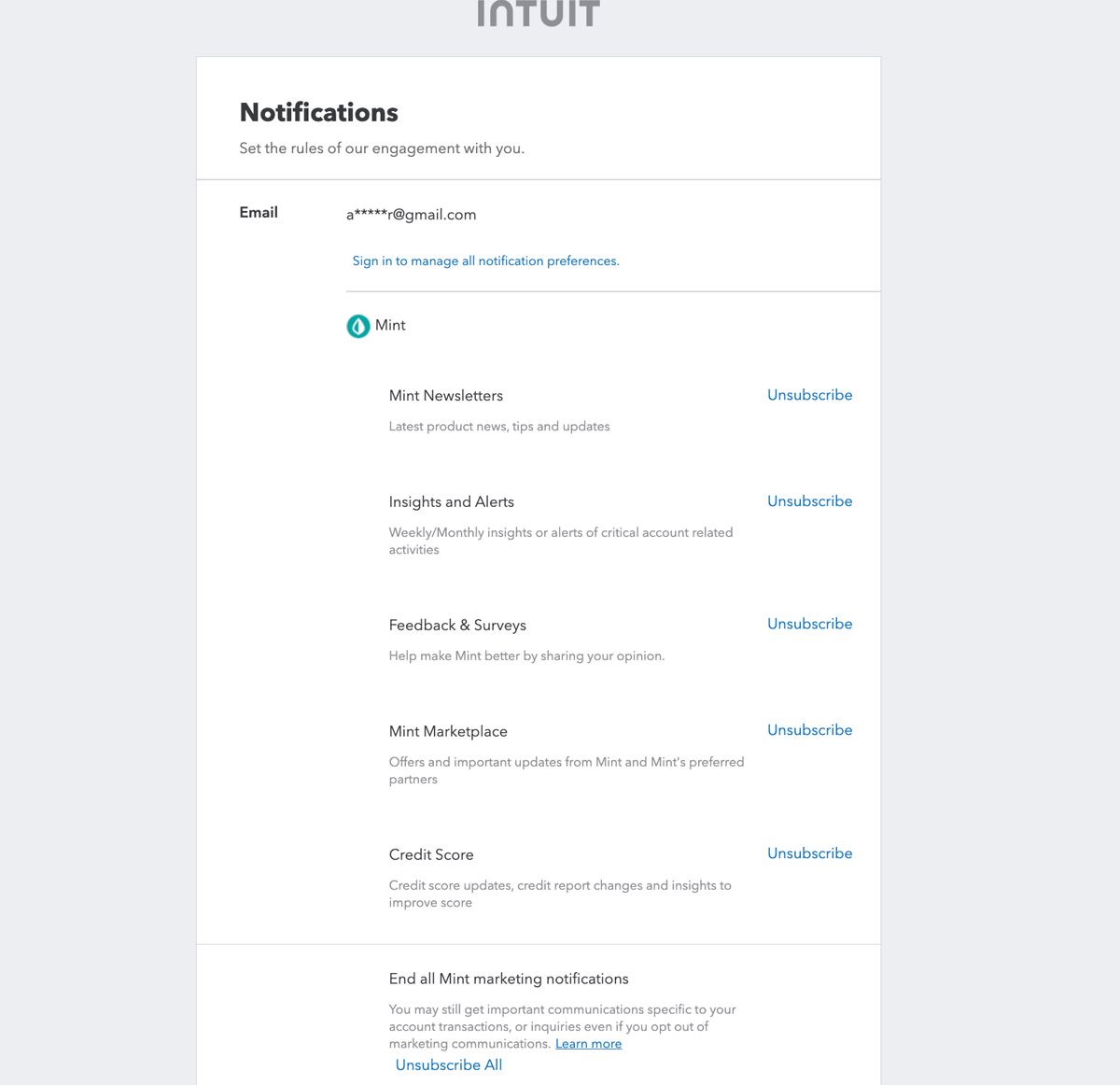
Inuit’s unsubscribe page clearly presents the different categories the visitor is currently subscribed to. If a prospect chooses to unsubscribe from your email marketing lists, you first have to give them that option. Inuit does a great job of not letting the subscriber leave so easily by giving them the option to update their setting and lessen the chance of losing them as a subscriber entirely.
Brands or businesses that have a strong sense of identity can play with how they word the unsubscribe message. A way to maximize your unsubscribe landing page is to do a split test that incorporates humor. You can consider using language that is cohesive with your product positioning while still poking fun, like saying, “This isn’t goodbye, just see you later,” or “Distance makes the heart grow fonder, we’ll be waiting for you.”
Coming soon pages are landing pages that hype up the release of a new product or business endeavor. They give visitors insight into some of the exciting features while also not providing a full reveal. The CTA of an email capture to get release updates can be attached to a big countdown or content element teasing the solution that’s coming soon.
Here is an example of a coming soon page from UPPERCASE:
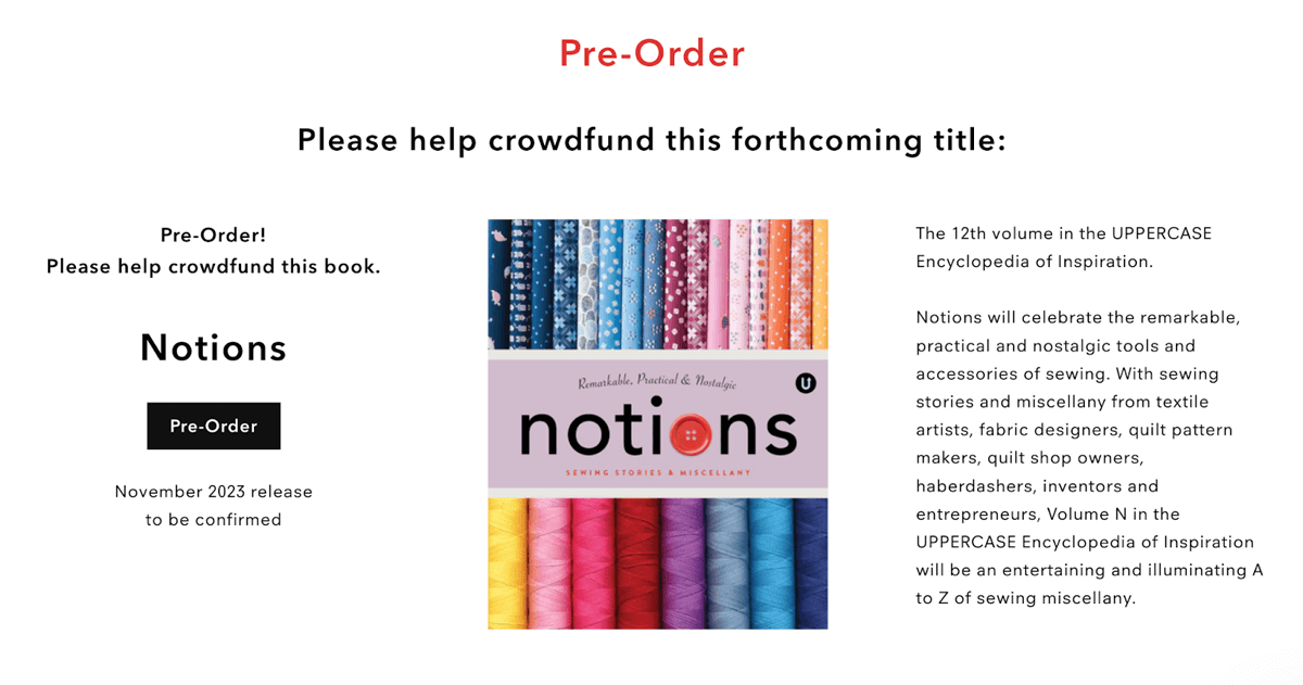
UPPERCASE’s page is specifically marketing an upcoming book drop and has a CTA for their visitor to go ahead and make a preorder purchase. This coming soon landing page is probably a part of the marketing campaign for their new book, Notions. This draws attention and creates excitement for the drop of the new book by including an image of the cover as well as a short summary.
Adding a clearer CTA can be as simple as an email capture form under the pre-order button to have the visitor sign up for newsletters. Another split test idea is to require more contact information from the visitor in exchange for early access to the product release. This way, with the help of a fun and highly visual countdown, you can still generate valuable leads.
An About Us page on your website can house a variety of information. It can include your mission statement, executive employees, the history of your business, and much more. A strong About Us landing page will deliver this information while capturing your brand's values or personality. With the use of a call-to-action or links, this page doesn’t have to be a dead end for your visitors.
Here is an example of an About Us page from Amazon:
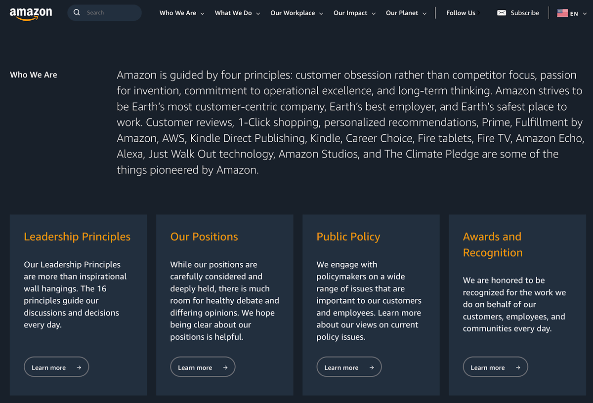
Amazon’s about us page capitalizes on having the attention of the visitor by directly guiding them to more informative or interactive pages like their open positions. Since About Us pages are understandably not the page on your website with the highest traffic, ones with strong CTAs like Amazon’s make them still valuable. Visitors on your About page are seeking more information on your business or brand, and a CTA offering a newsletter could suffice that.
A split test idea for an About Us page to consider is putting a lead capture form on the page. You could present it saying, “That’s enough about us. We want to know about you!” and there can be form inputs for the visitor’s name, email, zip code, and a quick list of product categories asking which on the list the visitor might be the most interested in.
Thank you or success landing pages are received when a web page visitor has completed a task or action already on your site. This could be a thank you due to a purchase going through or a successful download of the content you offer. The typical CTA following a thank you landing page is to return to the home page, check out similar items/content, or even provide additional offers.
Below is OpenTable’s thank you landing page:
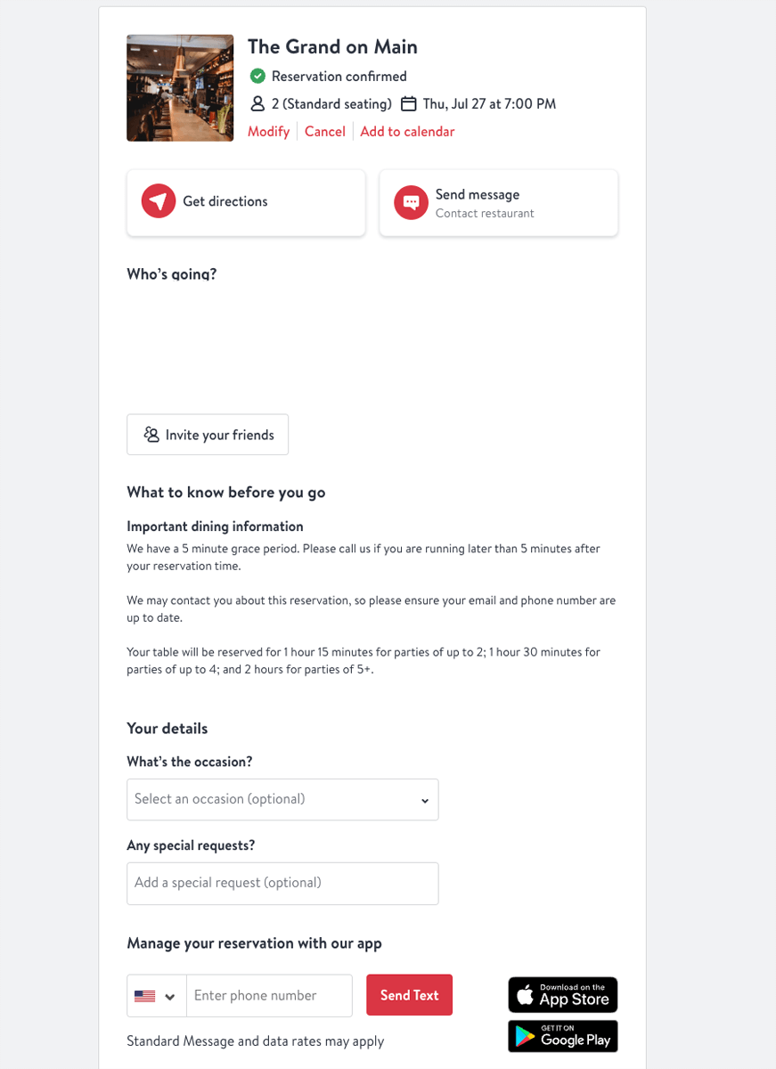
OpenTable has a great thank you/success page because it summarizes the entire transaction and gives the visitor the chance to enter their phone number for updates. This capitalizes on the fact the visitor is now its customer and suggests downloading their app from the app store. They’ve now interacted with OpenTable’s brand from beginning to end, and this landing page makes sure their good customer experience continues.
A split test idea for your thank you page is to play with what CTA they push for the visitor to take. In the OpenTable example, they ask for details and the visitor’s phone number for updates on their reservation and future promotions, which is one split test idea. You could also suggest similar items to the one your customer has just bought to get them to make another purchase with you.
When a visitor is on your website and clicks or triggers a page that has crashed or maybe no longer exists, they might encounter a 404 or error message. These pages are usually deadends and can be discouraging for the visitor to come across. Landing pages attached to 404 error messages create an opportunity for engagement that wasn’t there before and can offer value to the visitor and you.
Disney’s 404 error page looks like this:
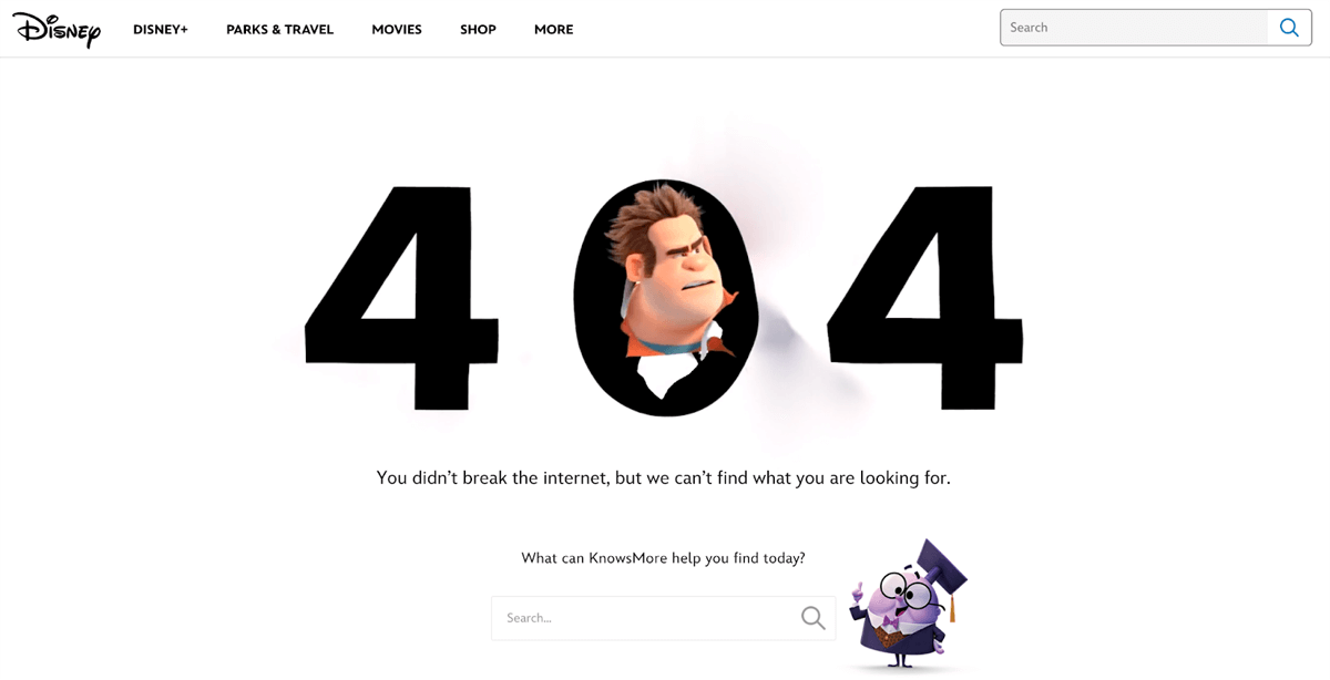
Disney has introduced humor to the page and used language that is cohesive with their brand identity. Having a web visitor come across a 404 page is never ideal, but this style of landing page takes advantage of having their attention and drawing it away from whatever the temporary issue is with the actual page. Disney’s character and language choice is purposeful for this exact reason.
Similar to the unsubscribe landing page potential split testing opportunity, introducing humor to a 404 error page can help maintain a positive visitor experience. Since receiving an error message can be frustrating, poking fun at the error can be entertaining for the visitor. Consider using witty language and a clear CTA that takes the visitor back to your home or FAQ page.
Split testing, also referred to as A/B testing, is when marketing, sales, and data teams test two variants of the same product or ad campaign to determine which gets the best results or response from their target audience. Measuring the response from audiences who interact with landing page A versus landing page B will help marketers understand which resonates best and results in the ideal action being taken by their customers.
Since landing pages can be accessed on different sized screens like desktops or mobile devices, the page itself should be a pixel size that can translate and read well on any screen. The average landing page size is between 960 and 990 pixels. This’ll ensure the content loads quickly, all at once, and at the highest quality possible.
Utilizing a landing page or pages can help drive valuable engagement in your online lead generation tactics. They take advantage of visitors on your site or those who are engaging with your ads and are already taking action with your brand. Now that you have a good idea of the different types of landing pages and ones you might consider, check out our guide to the top landing page builders that’ll help you bring your vision to life.

Allyssa is a sales writer with a background in B2B sales and account management. After earning her degree in English and communications, she spent her selling career supporting Fortune 1000 IT and finance companies including Bank of America, Wells Fargo, and Credit Karma. As a staff writer for Selling Signals, her specialties include lead nurturing, lead generation, and sales software topics. When she's not writing or updating articles, you can find Allyssa writing poetry, traveling, or picking up any new creative hobby.

Selling Signals delivers actionable advice for sales and marketing professionals. Learn strategies that help you hit targets, strengthen customer relationships, and win more business. Get expert advice on lead generation, sales processes, CRM software, sales management, and account management directly to your inbox.
Property of TechnologyAdvice. © 2026 TechnologyAdvice. All Rights Reserved
Advertiser Disclosure: Some of the products that appear on this site are from companies from which TechnologyAdvice receives compensation. This compensation may impact how and where products appear on this site including, for example, the order in which they appear. TechnologyAdvice does not include all companies or all types of products available in the marketplace.